We are one: Otolaryngology united for ENT patient care
As the Academy and Foundation move forward as contemporary organizations under the guidance of our updated Strategic Plan and vision for the future, it is only fitting that we update our theme and professional logo.
James C. Denneny III, MD, EVP/CEO AAO-HNS/F
As the Academy and Foundation move forward as contemporary organizations under the guidance of our updated Strategic Plan and vision for the future, it is only fitting that we update our theme and professional logo. Our vision states that the Academy/Foundation is the home for all professionals specializing in ear, nose, and throat care; that we are recognized as an inviting, accepting, and inclusive professional community fostering diversity within the specialty and the organization; and that we foster synergistic partnerships with international colleagues, specialty societies, allied health providers, and strategic partners.
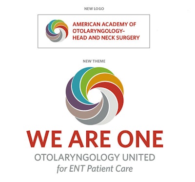
As we embark on this exciting and challenging Strategic Plan, it is imperative that we have a theme—“We Are One: Otolaryngology United for Patient Care”—and visual representation that embodies our vision and goals. We introduced our new logo and theme at the March Boards of Directors meetings and have started transitioning to our new design. We hope to complete the transition by the end of the fiscal year. We feel the logo is representative of our commitment to inclusivity at all levels needed to provide the best patient care in today’s world.
The design takes the shape of the “O” that starts “otolaryngology,” while the multi-colors suggest its multiple sub-specialties and their societies; the cultural and demographic diversity of our members and their patients; the global nature of our specialty; our many different practice settings, including both academic and private, rural and urban, domestic and international; and the collaborative interactions we share with the entire healthcare community. The intertwining design accentuates these properties. The circular nature of the design represents our continuing bond with our patients, the global nature of our organization, and the equality of all members of the team and patients they serve.
You will begin seeing our new logo and theme on all our communications, products, and productions in the near future. We plan to have T-shirts available for sale at the Annual Meeting and online. I want to thank our Communications Business Unit led by Kathy Lewis and our graphics design team led by Ross Rollins for their outstanding work in producing our new logo that represents the organization we strive to be in a simple, clean, and contemporary style.


